Web Design Principles Checklist
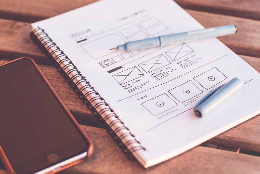
The first website arrived in the digital world on August 6th, 1991. Since then, many different web design principles have popped up; some still stand the test of time! When making a website, you want it to look good, which doesn’t happen by accident.
These principles still apply whether you’re part of a web design agency or an independent contractor. If you want to learn more, make sure to continue reading!
1. You Need Consistency
To start, you need to ensure that your overall website is very consistent. When you use too many different design elements, you risk your page looking cluttered and unfocused. Plus, it becomes harder for your viewers to find the information that they need.
When it comes to consistency, you want to use the same:
- Fonts
- Colors
- Page arrangements
- Headers and footers
You want to use the same design elements throughout your site. If you change them too often, the appearance of your website is sure to suffer! Overall, consistency is the most critical web design principle. It would be best if you used it in all your projects.
2. Choose Simplicity
Next, you always want to choose simplicity over a complex design. Simple pages are often more attractive to visitors, who also can find what they need with ease. When you have an intricate design, it can get too distracting. You may want to rearrange your site or cut back on some content.
Just because you choose, a simple theme doesn’t mean it’s going to look bland. When there’s less to work with, you can take your ideas and perfect them! This benefit makes your site look well thought out and put together.
There are several different simple layouts that you can choose from. You’ll want to base your layout on a grid, then work with the placement of your columns from there. This principle comes from typography and magazine layouts, which apply to web design today.
Simplicity also helps keep your website consistent- which is key to creating a beautiful, functional webpage!
3. Functional Navigation
Even if your website looks stunning, users won’t like it if they can’t find what they need! You’ll want to make sure that the page has functional navigation. That way, visitors won’t feel overwhelmed when they open your home page.
Start by structuring your website in a way that makes sense. Everything should feel logical, allowing browsers to navigate to the pages they want to see quickly. You can help them by including a search bar, menus, and easy-to-see headlines.
If you already have your site set up, ask a friend or family member to take a quick look at it. Where do they click first? Can they easily find what they need? If they seem to have trouble, you’ll want to work on your site’s navigation.
No matter how much time passes, seamless navigation will always be an essential principle in web design! It’s not an element that you want to overlook.
4. Strong Visuals
Additionally, you want your website to have plenty of solid visuals. Images, colors, and typography can communicate your message to others. When you have a distinct visual style on your page, it also sticks out more in people’s minds.
When you include more strong visuals to the site, you also increase your brand identity. If you don’t have one yet, it’s worth spending time on it! The visuals will bring back visitors time and again, helping you draw more traffic to your sites.
Only add content to the page that has intent- you don’t want to fill the space with weak imagery.
5. Use Hierarchy Structures
When laying out the page, make sure to add a hierarchy within your content. You’ll want to have the essential information somewhere that’s easiest to see. Then, you can move on to less critical content. Hierarchy has always been significant in web design and will continue to be!
To achieve a natural hierarchy, you can use a grid structure. Blank space and contrasting colors also draw a lot of attention. Overall, using a system ensures that your visitors can easily take in the information that you want!
6. Design For Mobile Users
It’s also essential that you don’t forget about mobile users! More people browse the internet solely through their smartphones than in the past. If your site doesn’t load right for them, you can miss out on a ton of traffic.
It’ll take additional effort to make the site more mobile-friendly. Many professional designers today make the page for mobile-first, then adjust it for desktop visitors. This method ensures that everyone’s smart devices can easily access your pages.
7. Enhanced Responsiveness
The best websites offer outstanding performance. It should load fast and respond quickly to your users as they navigate the site.
To do this, you’ll need to optimize your website. That means adjusting images and other content that takes a long time to load. Additionally, you’ll likely need to take a look at your source code.
Finally, if something doesn’t load correctly, you want to ensure there’s an error message for your users. Without one, they may leave the site immediately and not return. With an error message, they may try to reload the page before leaving.
Overall, better responsiveness will ensure that your visitors have a better experience on your website.
8. A Call To Action
Finally, you need to end your page with a short call to action. It can differ depending on what you want your audience to do. Maybe you want them to contact you or buy a product. Ending with a call to action is great for conversions on any website!
Focus On Visitors
In short, you want to focus on your visitors to the site. Anything you do to improve their experience is sure to increase your traffic! Take the time to optimize your site and add more structure for easy navigation. Both web design agencies and freelancers can benefit from learning more about these principles.